That being said, today I am focusing on cover pages. The possibilities for these bad boys are endless and the thought of coming up with one from scratch can be somewhat overwhelming to a new TpT seller, but I think I am up to the task. I've decided that for my post today, I am actually going to create a new cover page design step-by-step and post the progress photos within this at the same time, almost like creating a small guide.
To begin, I prefer using Publisher to PowerPoint (moving items is easier and they don't jump around as much). I am working on Windows 7 (versions 8 and 10 simply aren't for me) and I'm using Microsoft Office 2016 software. My goal is to create my own cover page template that I can use in all of my TpT products. I really want clean and consist product listings and CPs... So let's get started!
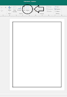 1. First things first, I love nice thick black lines. So when I'm creating my cover, I want that aspect to stand out. This may not be everyone's style, but that is okay! In order to accomplish this look, I simply go to the top bar and select insert shape, click on the rectangle, and draw it to match the blue lines on the sheet. I then click on Drawing Tools Format in the top bar to edit my shape. Select shape outline, slide down to weight, and select 4 1/2 pt.
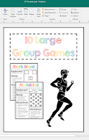
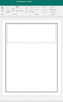 2. Now that I have my base shape and outline completed, I want to add a place for my product title and a very brief description. In order to place these areas, I will be using the principle of thirds. To learn more about this, check out an awesome {and free} product by Tracee Orman that can be found here. When completing this step, I inserted a text box and centered it based on the green lines I placed in those third categories. I then when to format shape, outline, and selected a short dashed line for the border of this box. I also made the line thickness for this object slightly thinner at 3 pt instead of the 4.5 pt I used for the outer border. If you'd like to make more work for yourself, you can also insert a regular rectangle {as opposed to the text box}, format the outline of that box and then insert a text box. This does allow you to move and play with the font inside the box as opposed to the box only fitting to the font. Just some food for thought when designing your CP.
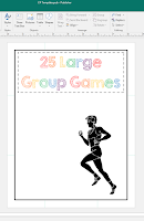 4. Now I'm ready to add some pop and clip art! Using the principle of thirds, I want to place my clipart where two of my third lines meet. In this circumstance, I'm going to place my clipart in the lower right thirds. The clipart I've been using in a lot of my products come from The Imaginative Teacher. He was some great physical education clipart that I really enjoy using. I've elected to use his running man for the sake of this CP. What's nice about this style of clipart is that you can also change the color of the image if you'd like, but for now, since I've used a lot of color in the title, I'm going to keep this image simple. Now that I've added an extra element, it's time to add some features. This can be a multitude of things so bear with the next section.
5. When adding highlights of your product to the CP, you can go in many different directions. I prefer to showcase the product itself as opposed to adding a bunch of clip art pictures. For this CP, I'm going to add PNG files of my product pages on the left hand side to fill all the leftover white space. To make your products into PNG format, simply select them all, right click, and select save as picture. You can then insert it into your CP product later! I like the feel and appeal of this layered look for highlighting the content in my product. You get a feel for multiple pages within and have the opportunity to highlight two titles you're excited about. I also decided that once I added the two PNG's that I wanted my running man to face the opposite direction, so I simply performed a rotate horizontal function on him and bam!
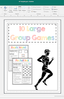 6. We're almost there! We've followed the principle of thirds throughout our CP placement, but we're still looking a little plain. I personally enjoy how clean the white looks, but we're missing something... When in doubt, I firmly believe in BORDERS. They can take a plain paper and make it look quite nice. For the sake of this example, I'm just going to add two new rectangles to my page, each slightly smaller than the larger border. I want to make sure to set the fill to "no fill" so that it doesn't block the elements I already have on the page. Once you've done this, pat yourself on the back because YOU DID IT! You've created your own awesome cover page for your next TpT product! Now go celebrate by posting that bad boy and hopefully making some sales!
Until next time,
xoxo. The Sassy PE Teacher


No comments:
Post a Comment